introducing vizscorer: a bot advisor to improve your ggplot plots
One of the most frustrating issues I face in my professional life is the plentitude of ineffective reports generated within my company. Wherever I look around me is plenty of junk charts, like barplot showing useless 3D effects or ambiguous and crowded pie charts. I do understand the root causes of this desperate state of the art: people have always less time to dedicate to reports crafting, and even less to dedicate to their plot. In the crazy and speedy-going working life, my colleagues have no time and for learning data visualization principles. Even so, this remains quite a big problem since a lot of time and money-wasting consequences come from poorly crafted reports and plots:
tags:
R /algorithm /analytics /dataviz /my_packages /
getting to know the new definition of default
2018/07/13
The greatest part of my time at working is spent looking at those great piece of statistical machinery that credit risk models are.
That is why I was recently required to prepare a short course about the new definition of default, which is goign to be applied from 01/01/2021 on.
It is quite a unexplored topic in the sector and I haven’t found a lot of teaching material online, that is why I tought to share here the brief deck of slide I produced for the occasion. Enjoy and feel free to comment.
tags:
banking /
how to use PaletteR to automagically build palettes from pictures
2018/05/08
I live in Italy, and more precisely in Milan, a city known for fashion and design events. During a lunch break I was visiting the Pinacoteca di Brera, a 200 centuries old museum. This museum is full of incredible paintings from the Renaissance period. During my visit I was particularly impressed from one of them: “La Vergine con il Bambino, angeli e Santi”, by Piero della Francesca.
tags:
paletteR /R /Rstudio /dataviz /data analysis /data analytics /my_packages /
UpdateR package: update R version with a function (on MAC OSX)
2018/03/10
I personally really appreciate the InstallR package from Tal galilli, since it lets you install a great number of tools needed for working with R just running a function.
tags:
algorithm /analytics /R /my_packages /
Learning Dataviz Principles and Theory from Tufte
2018/02/10
I have recently completed a great reading: Edward Tufte’s The visual display of quantitative information. In the dataviz realm, this is some kind of fundamental book. This book was some kind of structural break in the history of data visualization. In ’70s and ’80s graphics were considered a way to entertain less educated readers. Their ability to make available new insights and communicate them effectively was underestimated.
tags:
dataviz /
2017
Why are you being so silent?
2017/04/12
It has being nearly half an year since the last post about workflower was out, why did I stay so silent for that long?
I have three major updates to explain the silence:
2016
streamline your analyses linking R to sas and more: the workfloweR
2016/09/21
we all know R is the first choice for statistical analysis and data visualisation, but what about big data munging? tidyverse (or we’d better say hadleyverse 😏) has been doing a lot in this field, nevertheless it is often the case this kind of activities being handled from some other coding language. Moreover, sometimes you get as an input pieces of analyses performed with other kind of languages or, what is worst, piece of databases packed in proprietary format (like .dta .xpt and other). So let’s assume you are an R enthusiast like I am, and you do with R all of your work, reporting included, wouldn’t be great to have some nitty gritty way to merge together all these languages in a streamlined workflow?
tags:
analytics /data analysis /data analytics /programming /R /sas /shiny /
ggplot2 themes examples
2016/08/09
this short post is exactly what it seems: a showcase of all ggplot2 themes available within the ggplot2 package. I was doing such a list for myself ( you know that feeling …“how would it look like with this theme? let’s try this one…”) and at the end I thought it could have be useful for my readers. At least this post will save you the time of trying all differents themes just to have a sense of how they look like.
tags:
analytics /data analysis /dataviz /ggplot /ggplot2 /ggthemes /hacking /plot /png /R /themes /
Euro 2016 analytics: Who's playing the toughest game?
2016/06/21
I am really enjoying Uefa Euro 2016 Footbal Competition, even because our national team has done pretty well so far. That’s why after browsing for a while statistics section of official EURO 2016 website I decided to do some analysis on the data they share ( as at the 21th of June).
Just to be clear from the beginning: we are not talking of anything too rigourus, but just about some interesting questions with related answers gathered mainly through data visualisation.
tags:
analytics /data /data analysis /data analytics /Github /R /Rstudio /soccer /
a Checklist for your weekly review (GTD methodology)
2016/05/17
I was crafting this checklist for my personal use, and then I found myself thinking: why should’nt I share this useful handful of bullets with my readers? So here we are, find below an useful checklist for your weekly review. The checklist is derived directly from the official GTD book by our great friend David Allen. The greatest quality of the checklist is the minimalist approach: just what you really need to read is written within each point, so that you get through your review as quick as possible. Enjoy!
tags:
gtd /lifehacks /timemanagement /
Over 50 practical recipes for data analysis with R in one book
2016/05/11
Ah, writing a blog post! This is a pleasure I was forgetting, and you can guess it looking at last post date of publication: it was around january... you may be wondering: what have you done along this long time? Well, quite a lot indeed:
2015 in review (let me boast myself a bit :))
2016/01/01
The WordPress.com stats helper monkeys prepared a 2015 annual report for this blog.

Here’s an excerpt:
The concert hall at the Sydney Opera House holds 2,700 people. This blog was viewed about **8,800** times in 2015. If it were a concert at Sydney Opera House, it would take about 3 sold-out performances for that many people to see it.
Click here to see the complete report.
2015
Rename a Data Frame Within a Function Passing an Argument
2015/12/14
This is not actually a real post but rather a code snippet surrounded by text.
Nevertheless I think it is a quite useful one: have you ever found yourself writing a function where a data frame is created, wanting to name that data frame based on a custom argument passed to the function?
For instance, the output of your function is a really nice data frame name in a really trivial way, like “result”.
tags:
analytics /R /Rstudio /
how to list loaded packages in R: ramazon gets cleaver
2015/09/10
It was around midnight here in Italy:
I shared the code on Github, published a post on G+, Linkedin and Twitter and then went to bed.
In the next hours things got growing by themselves, with pleasant results like the following:
https://twitter.com/DoodlingData/status/635057258888605696
The R community found ramazon a really helpful package.
And I actually think it is: Amazon AWS is nowadays one of the most common tools for online web applications and websites hosting.
tags:
algorithm /amazon /analytics /apps /aws /data analytics /R /Rstudio /shiny /shiny apps /
ramazon: Deploy your Shiny App on AWS with a Function
2015/08/18
Because Afraus received a good interest, last month I override shinyapps.io free plan limits.
That got me move my Shiny App on an Amazon AWS instance.
Well, it was not so straight forward: even if there is plenty of tutorials around the web, every one seems to miss a part: upgrading R version, removing shiny-server examples… And even having all info it is still quite a long, error-prone process.
All this pain is removed by ramazon, an R package that I developed to take care of everything is needed to deploy a shiny app on an AWS instance. An early disclaimer for Windows users: only Apple OS X is supported at the moment.
tags:
amazon /analytics /aws /data analysis /hacking /R /shiny /shiny apps /
Introducing Afraus: an Unsupervised Fraud Detection Algorithm
2015/07/02
The last Report to the Nation published by ACFE, stated that on average, fraud accounts for nearly the 5% of companies revenues.
on average, fraud accounts for nearly the 5% of companies revenues

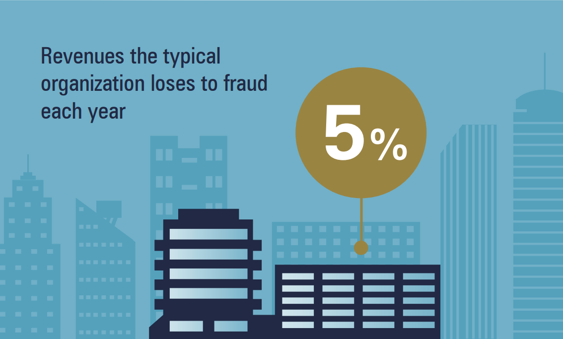
Projecting this number for the whole world GDP, it results that the “fraud-country” produces something like a GDP 3 times greater than the Canadian GDP.
tags:
algorithm /analytics /apps /computer science /data /data analysis /data analytics /fraud /fraud analytics /internal audit /R /shiny /shiny apps /
How to add a live chat to your Shiny app
2015/05/11
As I am currently working on a Fraud Analytics Web Application based on Shiny (currently on beta version, more later on this blog) I found myself asking: wouldn’t be great to add live chat support to my Web Application visitors?
It would indeed!
[caption id=“attachment_490” align=“aligncenter” width=“200”] an ancient example of chatting - Camera degli Sposi, Andrea Mantegna 1465 -1474[/caption]
tags:
analytics /apps /chat /data analysis /R /shiny /shiny apps /tutorials /
How to list file and folders within a folder ( basic file app)
2015/04/01
I know, we are not talking about analytics and no, this is not going to set me as a great data scientist… By the way: have you ever wondered how to list all files and folders within a root folder just hitting a button**?**
I have been looking for something like that quite a lot of times, for instance when asked to write down an index of all the working papers pertaining to a specific audit ( yes, **I am an auditor, **sorry about that): really time-consuming and not really value-adding activity.
tags:
hacking /tutorials /visual basic /windows /
Catching Fraud with Benford's law (and another Shiny App)
2015/02/06
In the early ‘900 Frank Benford observed that ’1’ was more frequent as first digit in his own logarithms manual.
More than one hundred years later, we can use this curious finding to look for fraud on populations of data.
What ‘Benford’s Law’ stands for?
Around 1938 Frank Benford, a physicist at the General Electrics research laboratories, observed that logarithmic tables were more worn within first pages: was this casual or due to an actual prevalence of numbers near 1 as first digits?
tags:
algorithm /analytics /data /data analysis /data analytics /internal audit /R /shiny /shiny apps /
2014
How to use Github with Rstudio : step-by-step tutorial
2014/12/28
Pushing to my Github repository directly from the Rstudio project, avoiding that annoying “copy & paste” job. Since it is one of Best Practices for Scientific Computing, I have been struggling for a while with this problem. Now that I managed to solve the problem, I think you may find useful the detailed tutorial that follows. I am not going to explain you the reason why you should use Github with your Rstudio project, but if you are asking this to yourself, you may find useful a **Stack Overflow discussion **on the topic.
tags:
Github /repository /Rstudio /tutorials /
Network Visualisation With R
2014/12/05
The main reason why
After all, I am still an Internal Auditor. Therefore I often face one of the typical internal auditors problems: understand links between people and companies, in order to discover the existence of hidden communities that could expose the company to unknown risks.
the solution: linker
In order to address this problem I am developing Linker, a lean shiny app that take 1 to 1 links as an input and gives as output a network map:
tags:
analytics /communities /data analysis /data analytics /internal audit /Linker /network analysis /R /
Querying Google With R
2014/11/19
If you have a blog you may want to discover how your website is performing for given keywords on Google Search Engine. As we all know, this topic is not a trivial one.
Problem is that the analogycal solution would be quite time-consuming, requiring you to search your website for every single keyword, on many many pages.
Feeling this way?
[caption id=“attachment_273” align=“aligncenter” width=“300”] “Pain and fear, pain and fear for me” - Oliver Twist[/caption]
tags:
algorithm /analytics /apps /google /R /Rstudio /SEO /shiny /shiny apps /social media /social media analytics /web query /
Best Practices for Scientific Computing
2014/11/05
I reproduce here below principles from the amazing paper Best Practices for Scientific Computing, published on 2012 by a group of US and UK professors. The main purpose of the paper is to “teach” good programming habits shared from professional developers to people that weren’t born developer, and became developers just for professional purposes.
Scientists spend an increasing amount of time building and using software. However, most scientists are never taught how to do this efficiently
Best Practices for Scientific Computing
Write programs for people, not computers.
1. _a program should not require its readers to hold more than a handful of facts in memory at once_


2. _names should be consistent, distinctive and meaningful_


3. _code style and formatting should be consistent_


4. _all aspects of software development should be broken down into tasks roughly an hour long<!-- more -->_
Automate repetitive tasks.
1. _rely on the computer to repeat tasks_


2. _save recent commands in a file for re-use_


3. _use a build tool to automate scientific workflows_
Use the computer to record history.
1. _software tools should be used to track computational work automatically_
Make incremental changes.
1. _work in small steps with frequent feedback and course correction_
Use version control.
1. _use a version control system_


2. _everything that has been created manually should be put in version control_
Don’t repeat yourself (or others).
1. _every piece of data must have a single authoritative representation in the system_


2. _code should be modularized rather than copied and pasted_


3. _re-use code instead of rewriting it_
Plan for mistakes.
1. _add assertions to programs to check their operation_


2. _use an off-the-shelf unit testing library_


3. _use all available oracles when testing programs_


4. _turn bugs into test cases_


5. _use a symbolic debugger_
Optimize software only after it works correctly.
1. _use a profiler to identify bottlenecks_


2. _write code in the highest-level language possible_
Document design and purpose, not mechanics.
1. _document interfaces and reasons, not implementations_


2. _refactor code instead of explaining how it works_


3. _embed the documentation for a piece of software in that software_
Collaborate.
1. _use pre-merge code reviews_


2. _use pair programming when bringing someone new up to speed and when tackling particularly tricky problems_
if you want to discover more, you can download your copy of Best Practice Scientific Computing here below
tags:
analytics /computer science /data analytics /R /
download data to excel from web
2014/10/28
This simple tutorial will show you how to download data into an excel spreadsheet, creating a web query.
Download data into excel
select “data” tab

select “from web”

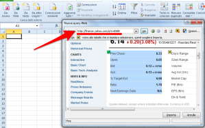
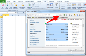
**select **data you want to download
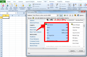
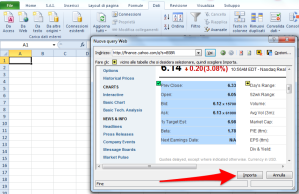
Refresh downloaded data
select “data” tab
![Image [9]](https://andreacirilloblog.files.wordpress.com/2014/10/image-9.png?w=300)
tags:
data /excel /excel spreadsheet /tutorials /web query /
excel right() function in R
2014/10/27
as part of the** excel functions in R,** I have developed this custom function, reproducing the excel right() function in th R language. Feel free to copy and use it.
[code language=“r”]
right = function (string, char){
substr(string,nchar(string)-(char-1),nchar(string))}
[/code]
you can find other function in the Excel functions in R post.
tags:
analytics /data /data analysis /data analytics /excel /excel spreadsheet /functions /R /
excel left() function in R
2014/10/27
as part of the excel functions in R, I have developed this custom function, emulating the excel left() function in th R language. Feel free to copy and use it.
left = function (string,char){
substr(string,1,char)}
you can find other function in the** Excel functions in R post**.
tags:
analytics /data /data analysis /data analytics /excel /functions /R /
excel functions in R
2014/10/25
I have started my “data-journey” from Excel, getting excited by formulas like VLookup(), right() and left().
then datasets got bigger, and I discovered that little spreadsheets were not enough, and look for something bigger and stronger, eventually coming to R.
But as you know, ones never forget the first love.
So, for fun and for practice, I have written down some of excel functions in R.
I hope you will enjoy.
tags:
analytics /excel /excel spreadsheet /R /
Data Visual 10/21: Plotly
2014/10/25
Learn dplyr with RStudio and Datacamp
2014/10/23
Mining Twitter with R
2014/10/09
Great tutorial on text mining with twitter byPaeng Angnakoon
[youtube=http://youtu.be/mJVcANlkxU8]
tags:
analytics /data analysis /R /tutorials /twitter /
Answering to Ben ( functions comparison in R)
2014/09/13
Following the post about %in% operator, I received this tweet:
https://twitter.com/benwhite21/status/510520550553165824
I gave a look to the code kindly provided by Ben and then I asked myself:
I know dplyr is a really nice package, but which snippet is faster?
to answer the question I’ve put the two snippets in two functions:
#Ben snippet dplyr_snippet =function(object,column,vector){ filter(object,object[,column] %in% vector) } #AC snippet Rbase_snippet =function(object,column,vector){ object[object[,column] %in% vector,] }
Then, thanks to the great package microbenchmark, I made a comparison between those two functions, testing the time of execution of both, for 100.000 times.
tags:
analytics /data analysis /data analytics /R /
How to Put Equations into Evernote
2014/09/11
Problem
Some time ago I was looking for an easy way to put some math writing within my Evernote notes trough my Mac device. Even if there is no official solution to the problem and the feature request is still pending within Evernote dedicated forum, I finally came out with a very simple way to solve your problem out.
tags:
evernote /tutorials /
Code snippet: subsetting data frame in R by vector
2014/09/02
Problem:
you haveto subset a data frame using as criteria the exact match of a vector content.
for instance:
you have a dataset with some attributes, and you have a vector with some values of one of the attributes. You want to make a filter based on the values in the vector.
Example: sales records, each record is a deal.
The vector is a list of selected customers you are interested in.
tags:
analytics /data analysis /R /tutorials /
Saturation with Parallel Computation in R
2014/07/28
I have just saturated all my PC:
full is the 4gb RAM

and so is the CPU (I7 4770 @3.4 GHZ)

Parallel Computation in R
which is my secret?
the doParallel package for R on mac
The package lets you make some very useful parallel computation, giving you the possibility to use all the potentiality of your CPU.
As a matter of fact, the standard R option is to use just on of the cores you have got on your PC.
tags:
analytics /data analysis /R /tutorials /
How to Visualize Entertainment Expenditures on a Bubble Chart
2014/07/12

I’ve been recently asked to analyze some Board entertainment expenditures in order to acquire sufficient assurance about their nature and responsible.
In response to that request I have developed a little Shiny app with an interesting reactive Bubble chart.
The plot, made using ggplot2 package, is composed by:
a categorical x value, represented by the clusters identified in the expenditures population
A numerical y value, representing the total amount expended
Points defined by the total amount of expenditure in the given cluster for each company subject.
Morover, point size is given by the ratio between amount regularly passed through Account Receivable Process and total amount of expenditure for that subject in that cluster.
tags:
analytics /data analysis /data analytics /R /shiny apps /
0001
0001/01/01
I live in Italy, and more precisely in Milan, a city known for fashion and design events. During a lunch break I was visiting the Pinacoteca di Brera, a 200 centuries old museum. This museum is full of incredible paintings from the Renaissance period. During my visit I was particularly impressed from one of them: "La Vergine con il Bambino, angeli e Santi", by Piero della Francesca.
 If you see this painting you will find a profound of colours with a great equilibrium between different hues, the hardy usage of complementary colours and the ability expressed in the "chiaroscuro" technique. While I was looking at the painting I started, wondering how we moved from this wisdom to the ugly charts you can easily find within today's corporate reports ( find a great sample on the WTF visualization website)
This is where
If you see this painting you will find a profound of colours with a great equilibrium between different hues, the hardy usage of complementary colours and the ability expressed in the "chiaroscuro" technique. While I was looking at the painting I started, wondering how we moved from this wisdom to the ugly charts you can easily find within today's corporate reports ( find a great sample on the WTF visualization website)
This is where Paletter comes from: bring the Renaissance wisdom and beauty within the plots we produce every day.
Introducing paletter
PaletteR is a lean R package which lets you draw from any custom image an optimized palette of colours. The package extracts a custom number of representative colours from the image. Let's try to apply it on the "Vergine con il Bambino, angeli e Santi" before looking into its functional specification.
Installing paletter
Since paletteR is available only trough Github we have to install it using devtools:
library(devtools)
install_github("andreacirilloac/paletter")
Creating a palette from your image
to draw our palette we now need to:
- pass the full path to the image through the _image_path_ arg
- specify tcolorser of colours we want to draw specifying the _number_of_colours_ attribute
- make clear if we need a palette for quantitative or qualitative variables, using the _type_of_variable_ arg.
Here it is the code (you can donwload the picture from wikicommons visiting https://it.wikipedia.org/wiki/File:Piero_della_Francesca_046.jpg):
create_palette(image_path = "~/Desktop/410px-Piero_della_Francesca_046.jpg",
               number_of_colors =20,
               type_of_variable = “categorical")
and here it is the output:
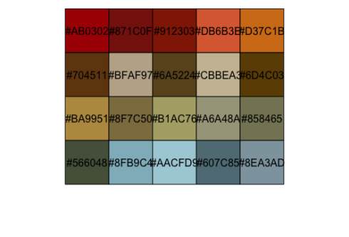 As you see the palette drawn contains all the most representative colours, like the red of the carpets or the wonderful blue of San Giovanni Battista on the left of the painting.
Functional specification
The main idea behind paletteR code is quite simple:
- take a picture
- convert into a three-dimensional RGB matrix
- apply kmeans algo on it and draw a sample of representative colours
- move to HSV colour space
- remove too bright and too dark colours leveraging HSV colour system properties
- further sample colours to select the most "distant" ones.
Let 'see how all this works in brief.
Reading a picture into the RGB colourspace
This first step involves transforming the image into an abstract object on which we can apply statistical learning. To do so we read the image file and convert it into a three multidimensional matrix. Within the matrix to each image pixel three numbers are associated:
- one for the quantity of Red
- one for the quantity of Green
- one for the quantity of Blue
All those three attributes range from 0 to 255, as requested by the rules of the RGB colourspace ( find out more on the related RGB colourspace page on wikipedia) . To perform this transformation we use the readJPEG() function from Jpeg package:
painting <- readJPEG(image_path)
this will generate an array having for each point within the image both the cartesian coordinates and the R, G and B values of the related colours.
We now apply some statistical learning on the array, to select most representative colours and create an optimized palette.
Processing the RGB image trough kmeans
This processing step was actually the first developed of the package and I already described it in a previous post. Within tht post I devoted the right time to expose some theoretical reference to the kmeans algo and it application to images. Please refere to the How to build a color palette from any image with R and k-means algo post to get a proper explanation of this. You can also read more about this algo and its inner rationales within R for data mining a data mining chrime book.
What we need to repeat here is that by applying the kmeans algo on the array we get a list of RGB colours, selected as the most representative of the ones available within the image.
I clearly remember my feeling when the first palette came out of kmeans: it was thrilling, but the results were undeemebly poors.
I came out for instance with this:
 What was wrong with the palette employed? We can pick at least three answers:
- there are too bright colours
- there are too dark colours
- there are too similar colours
To summarise: my package was stupid, it was unable to reasonate about relationship among colours avaiable.
To solve this problem I moved to the hsv colour space which is the perfect environment were to perform such kind of analyses. the HSV colourspace expresses every colour in terms of:
- Hue which properly expresses the colour, and gets a value from 0 to 360
- Saturation which expresses the quantity of colour (think about a pigment diluted with water to get it). This takes a value from 0 to 100%
- Brightness or Value, which express the quantity of grey or white included within the colour. This also takes a value from 0 to 100%
The way HSV system describes colours makes it easy to sort colours, moving from 0 to 360, and check for too bright or too dark colours, analysing distributions of saturation and brightness. You can get more on this on the really detailed Wikipedia page of HSV
Moving to the hsv colours space
To convert our RGB object into the HSV space we just need to apply rgb2hsv() to the values of R, G and B.
Removing outliers
What would you do next? After moving within the HSV realm we can now draw meaningful representations of our colour data. What paletteR does as a first step is to produce descriptive statistics for values of Saturation and Value.
First of all we calculate quartiles of all of those values:
brightness_stats <- boxplot.stats(sorted_raw_palette$v)
saturation_stats <- boxplot.stats(sorted_raw_palette$s)
Once being done with that we remove the lowest and highest of both. This lets us fix the first two problems observed in the first palette: too bright and too dark colours. What about the third problem?
Optimising palette
To get this solved we have to reasonate about the visual distance of colours. Look for instance at those colours?
 You would definitely say the first and the second are more distant from each other than the second and the third. You would definitely be right, but how to make our PaletteR as cleaver as you?
This is simply done within the HSV space leveraging the Hue attribute. As we have seen HSV hues are placed along a circle in a visually reasonable way. This means that a hue of 40 (which is some kind of orange) is way more distant from a hue of 100 (green) than a hue of 90 is ( another green).
Knowing this we just have to select from the first set of colours coming from kmeans a second subset of colours selected as the most _distant_. This will let us avoid employing colours appearing too similar.
How to do this? The current version of paletteR does it:
You would definitely say the first and the second are more distant from each other than the second and the third. You would definitely be right, but how to make our PaletteR as cleaver as you?
This is simply done within the HSV space leveraging the Hue attribute. As we have seen HSV hues are placed along a circle in a visually reasonable way. This means that a hue of 40 (which is some kind of orange) is way more distant from a hue of 100 (green) than a hue of 90 is ( another green).
Knowing this we just have to select from the first set of colours coming from kmeans a second subset of colours selected as the most _distant_. This will let us avoid employing colours appearing too similar.
How to do this? The current version of paletteR does it:
- generating a random sample of possible alternative palettes
- measuring the median distance among hues within the palette
- selecting the palette showing the greatest distance
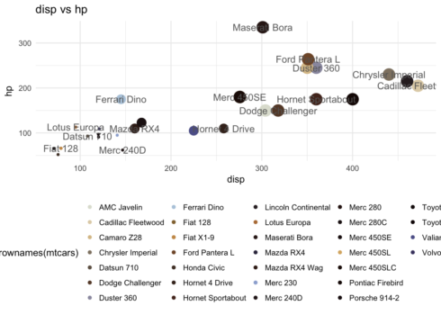
And here it is below the result for our dear Renaissance painting:
Isn't that better than the previous one?
How to apply paletteR in ggplot2
Applying the obtained palette in ggplot is actually easy. The object you obtain from the _create_palette_ function is a vector of hex codes (another way of codify colours, more on the Wikipedia page).
You therefore have to pass it to your ggplot plot employing scale_color_manual().A small side note: be sure to select a number of colours equal to the number of variables to plot.
Let's apply our palette by Raffaello with an hyphotetical plot:
colours_vector <- create_palette(image_path = image_path,
number_of_colors =32,
type_of_variable = “categorical")
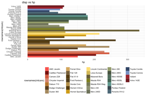
ggplot(data = mtcars, aes(x = rownames(mtcars),y = hp,color = rownames(mtcars),
fill = rownames(mtcars))) +
geom_bar(stat = 'identity') +
scale_color_manual(values = colours_vector) +
scale_fill_manual(values=colours_vector)+
theme_minimal() +
guides(size = FALSE) +
theme(legend.position = "bottom") +
labs(title = "disp vs hp")+
coord_flip()
Which will produce:
Join us
paletter is quite a young package, nevertheless it already catched some interest (I was also invited to give a speach about it, you can watch it online).
This is because of:
- its simple and rather powerful application of statistical learning to the color space
- the flexible code
- the high number of possible use cases
Since it is a young package there is still some work to do on it. I can see at least the following areas where further improvements could be introduced:
- authomatic selection of the type of variables among categorical and continous
- computation of the final optimised palette, introducing more advanced measures of colour distance.
- code profiling
Would you like to give an help on this? Welcome on board! You can find the full code on Github and every contributions is welcome.
0001/01/01
a quick ride on pagedown: create PDFs from Rmarkdown
celebrating beauty
PaletteR has been staying around for nearly two years, and #rstats user have made a lot of great stuff with it. I therefore took the time to collect what I have found around the web. You can find them below in a slideshow.