I have recently completed a great reading: Edward Tufte’s The visual display of quantitative information. In the dataviz realm, this is some kind of fundamental book. This book was some kind of structural break in the history of data visualization. In ’70s and ’80s graphics were considered a way to entertain less educated readers. Their ability to make available new insights and communicate them effectively was underestimated.

To be fair I have to say that in my professional experience data visualization is still often misunderstood. I have often heard sentences like: “yeah, place a nice plot there, so to make the document a bit nicer”. Or “no, no, you have placed too much plots here: this is a serious document!”. Even when people understand the importance of dataviz they usually don’t know how to craft an effecttive plot.
These are exactly the two kind of problems Tufte’s book tries to solve:
- showing people that dataviz is a serious discipline, needed to gain new and better knowledge of data
- showing people how to craft effective charts, ensuring integrity and technical excellence.
And the book does its job greatly!
This is why after reading the book I jot down some sketches to summarise its main tenets. I think these sketches can be useful to communicate and learn Tufte’s lessons, that’s why I share them below (to be honest, I have polished them a bit before publishing them here…)
theory of data graphics
Theory of data graphics leans on three main concepts:
- data-ink ratio
- high resolution graphics
- shape and placement of the graphics
let’s see the actual principles stated by Edward.
maximise data-ink ratio, within reason
To get this principle you first have to get what data-ink is. Data-ink is all the non redundant ink arranged in response to data variation in the numbers represented. Let’s show this in a sketch:
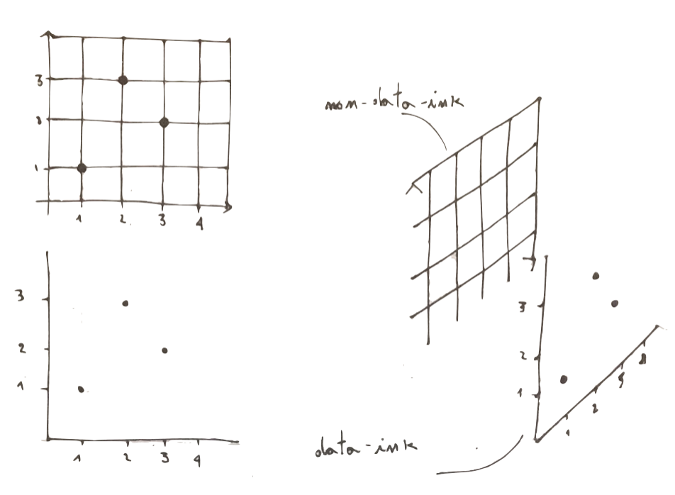
You can now easily get what data-ink ratio is:
\[ data-ink-ratio = \frac{data-ink}{non-data-ink + data-ink}\]
So it represents the share of ink devoted to data in a graph. Maximising the ratio means look at your plot and start thinking about what you can remove without loosing informative power.
maximise data density and the size of the data matrix, within reason
this second principle bases on the concept of data density of a display which is defined as:
\[data \quad density = \frac{number \quad \quad of \quad entries \quad in \quad the \quad data \quad matrix \quad behind \quad a \quad graph}{area \quad of \quad data \quad display}\]
Tufte observes that our eyes have a great resolution power, and we can thus maximise the data density and still keep our plot informative.
treat graphics as paragraphs and shape them appropriately
this last principle comes from a sad evidence related to computer graphics. The introduction of these techniques resulted in a strong separation between text and graphics. This was not the same in the origins, when text and graphics where happily merged together. Look for instance at this fascinating page from Da Vinci’s Atlantic code:

After a delicious dissertation on the golden ratio,
Tufte comes to define the way to set a proper shape for a graph:
- if the graph suggests a shape by itself, follow the suggestion
- in all other cases, display your plots within a rectangular shape, having one side 50% greater than the other.
This principle is as effective as simple. Look for instance at this two plots equals or all apart their size:
integrity of data graphics
Integrity of data graphics means developing graphics that do not lie. The honest plot doesn’t distort reality, it tells the truth. Find below the principles you have to respect to produce an honest plot.
always show data in their context
to get this you just have to look at the following sketch:
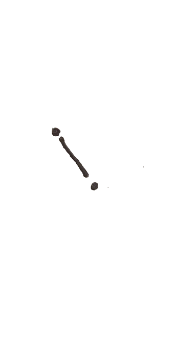
what you think is going on with this phenomenon? you can not actually understand too much from this to isolated point. May be you would think that some kind of drecrease is happening here.
Now take the same points and add some different possible contexts:
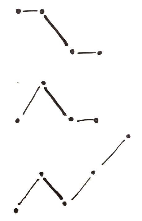
as you can see there each of this three contexts makes you read the two points in a different way. This shows you how relevant is to show data in their context.
try to produce a small lie factor
The lie factor is a mathematical way to measure how much a plot is distorting reality. It is defined as:
\[ lie \quad factor = \frac{percentage \quad of\quad variation \quad on \quad the \quad plot}{percentage \quad variation \quad in \quad reality}\]
Once again, things will be clearer if we look at a plot:
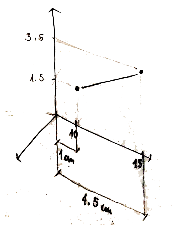
if we now compute the percentage variation of the phenomenon in reality we get:
\[ \frac{(15-10)}{10} *100 = 50\%\]
we then look at the percentage variation on the plot. To measure it we look at the real number of centimetres involved in the change from 10 to 15: \[ \frac{(4.5cm - 1cm)}{1cm} *100 = 350\% \]
and the lie factor thus is : 350/50 = 7
what does this number mean? it means that for a real variation of 50% a variation of 350% is showed on the plot. in other words our plot is increasing the real variation by 7 times.
If we now look at a correct plot we have:
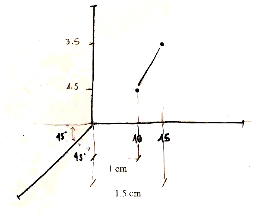
while the real increase is once again the 50%, what about the showed variation? we can compute it as follows:
\[ \frac{(1.5 - 1)}{1} * 100 = 50\%\]
which is exactly the real variation. This is thus an example of honest plot!
show data variation, not design variation
we can get this point looking at two plots showing the same phenomenon:
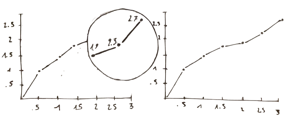
Looking at the one on the left: what would you say about the last three points? How they compare to the other points? We actually have some problem to make sure comparisons.
On the right we have the same numbers, even so they look here much clearer than in the previous plot. This is because here we show data variation rather than design variation.
use as many dimensions as the number of dimensions in your data
Finally, let’s destroy a false mith: bubble chart are not good. Take for instance the following one:
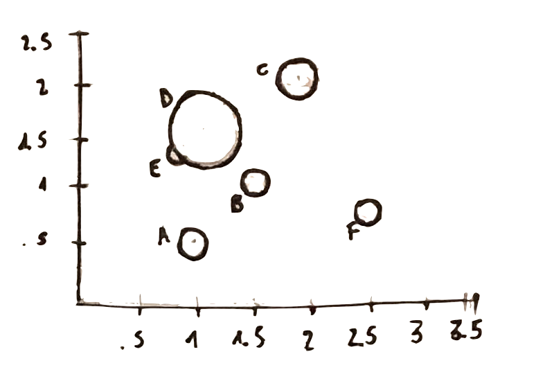
how could you say if the variable related to the size of the bubble has a greater value for A than for C?
What about point E?
where would you place the center of point D?
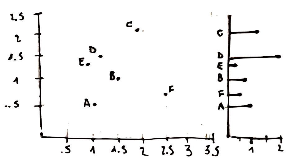
All those questions lead us to this last principle, showing how ineffective can be . A better way to display the same data would be to split the bubble chart into to separate plot. This would allow to show the third dimension with an horizontal bar chart.
how to apply Tufte’s principles in R
Once completed reding the book it was natural for me to think how to apply those principles with R, my favourite programming language.
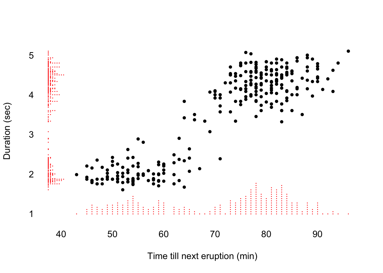
So far I have found one main go to reference for this task: Tufte in R by Lukasz Piwek. within the website you will find the best plot from Tufte’s book, reproduced both with base R code and ggplot-alike code, like the following marginal histogram scatterplot:
## Carico il pacchetto richiesto: usethis## SHA-1 hash of file is 1eaf278aced5a1206f1c0bffab087d26f44e3f73