Italy NCOV-19 outbreak
For personal reasons I am trying to track the number of NCOV-19 confirmed cases in Italy as well as the number of deaths (since I live in Italy, it is not difficult to guess the personal reason…). I am thus regularly monitoring news from the italian official sources like “Regione Lombardia” and “Protezione Civile”.
You can find the data on the official italian repository on Github the raw data I am collecting.
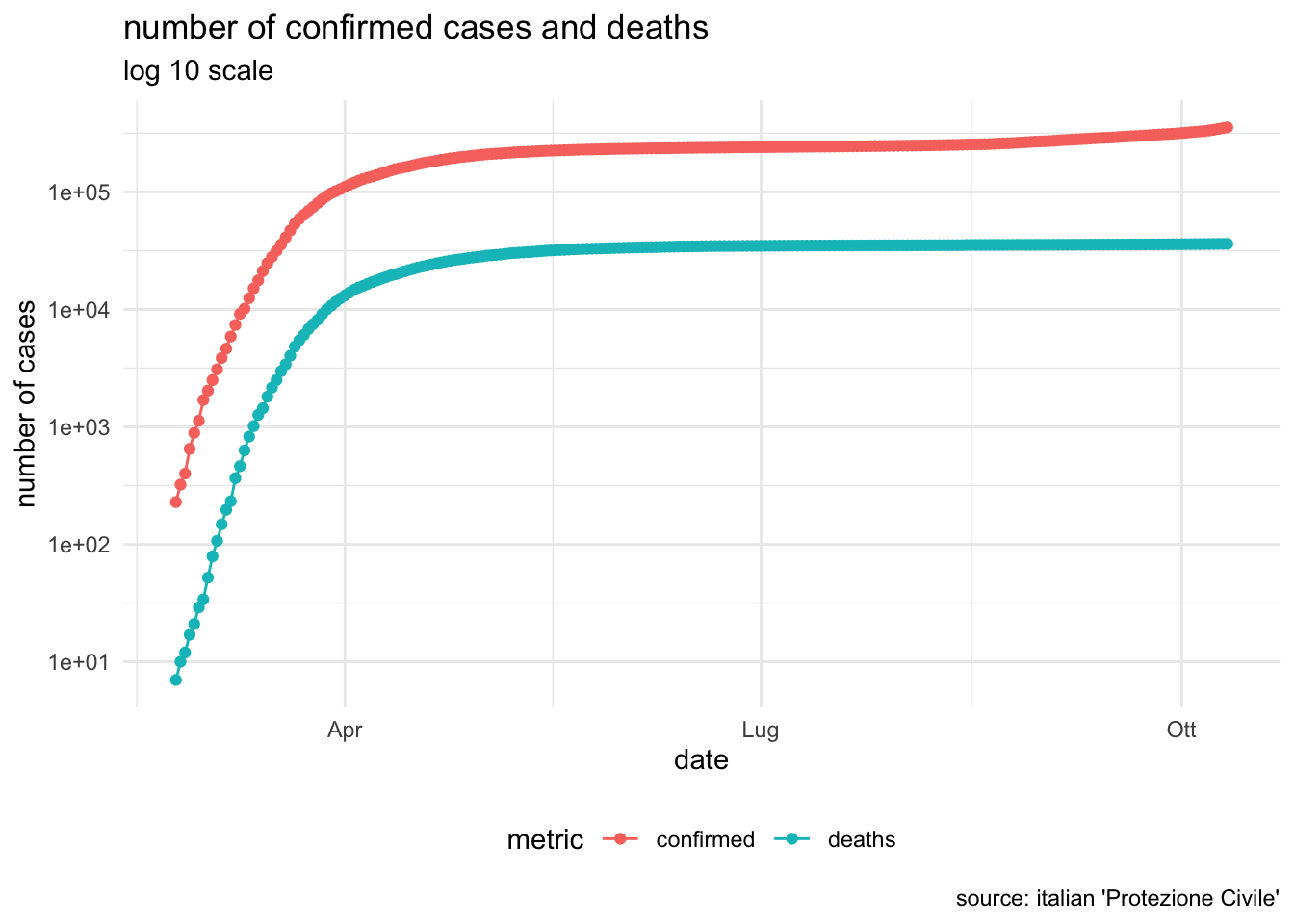
number of confirmed cases and deaths in Italy
Here is an attempt to visualize historical series of total confirmed cases and deaths
daily change in confirmed cases in Italy
and finally here a visualization of daily change in confirmed cases:
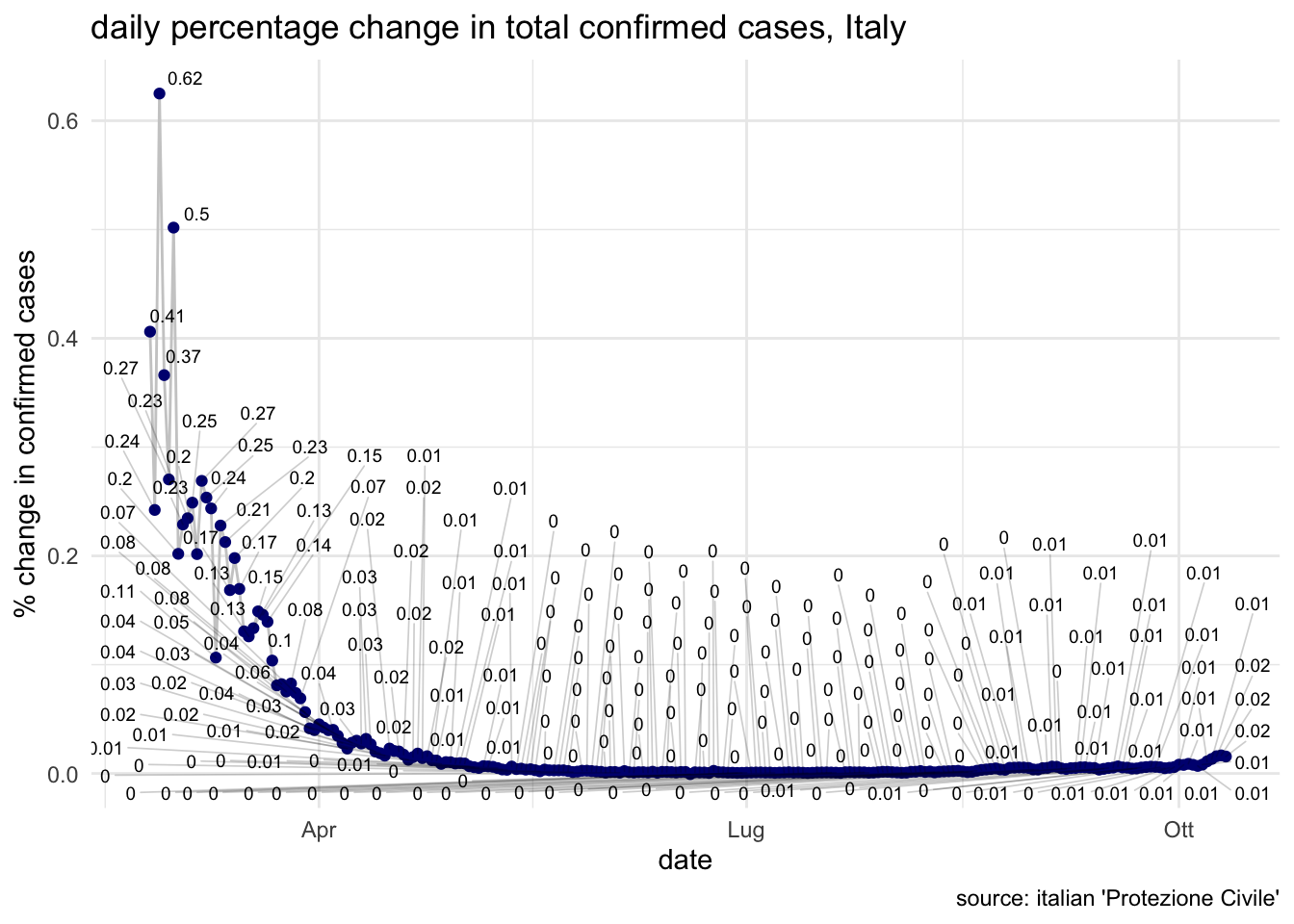
It is interesting to compare this trend with the one observed in Mainland China
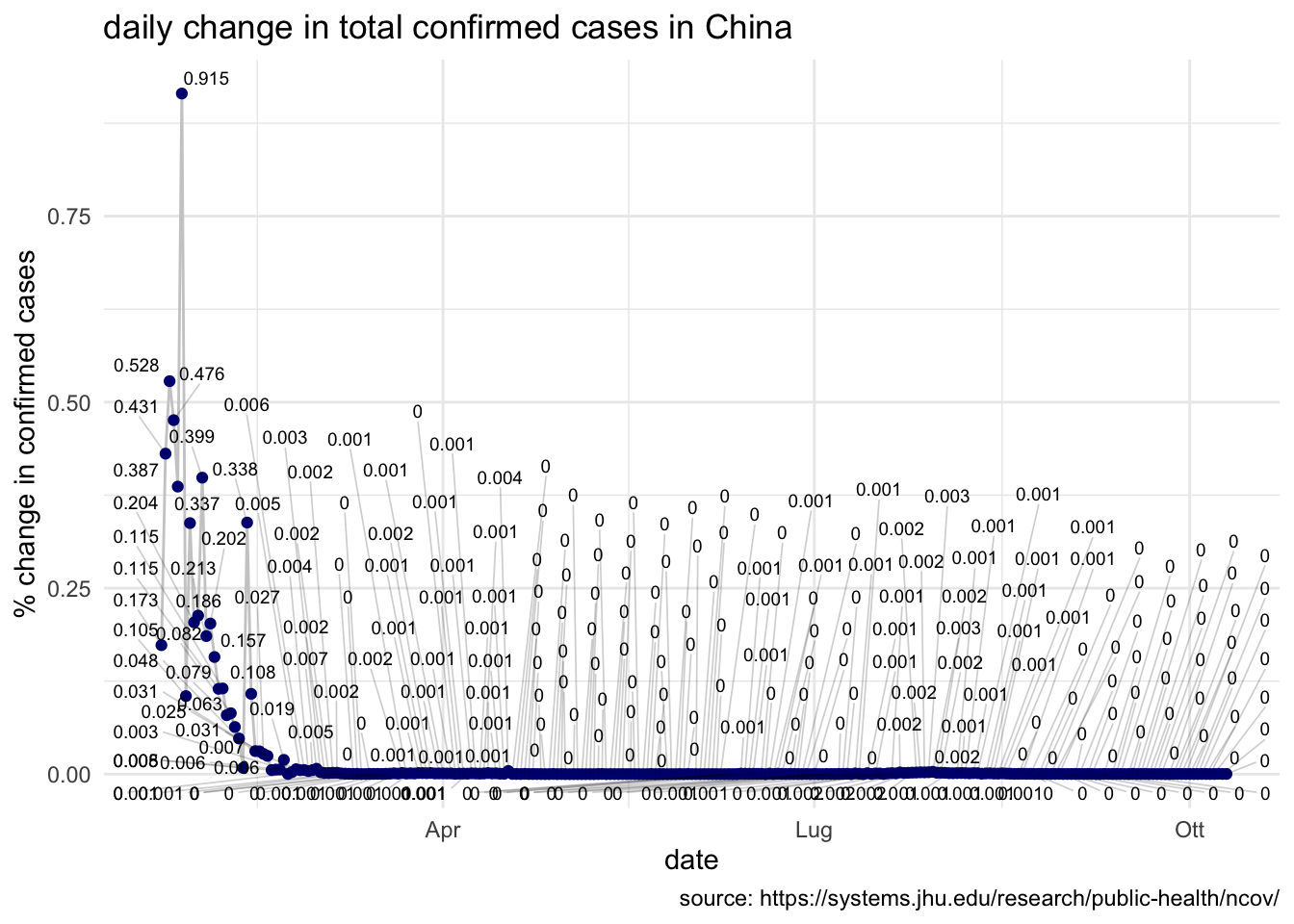
The italian level is aligned with the chinese one during the first part of the outbreak.
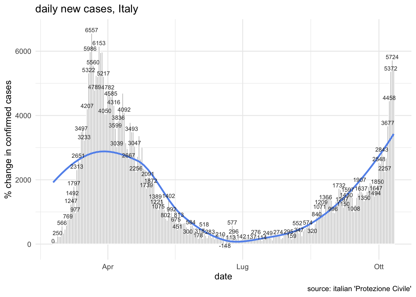
daily confirmed cases in Italy
The most waited day from the beginning of the outbreak is the one in which the number of daily confirmed new cases will reach its peak and we will start to see a reduction of new cases within the subsequent days. Let’s thus monitor this metric as well in the following plot:
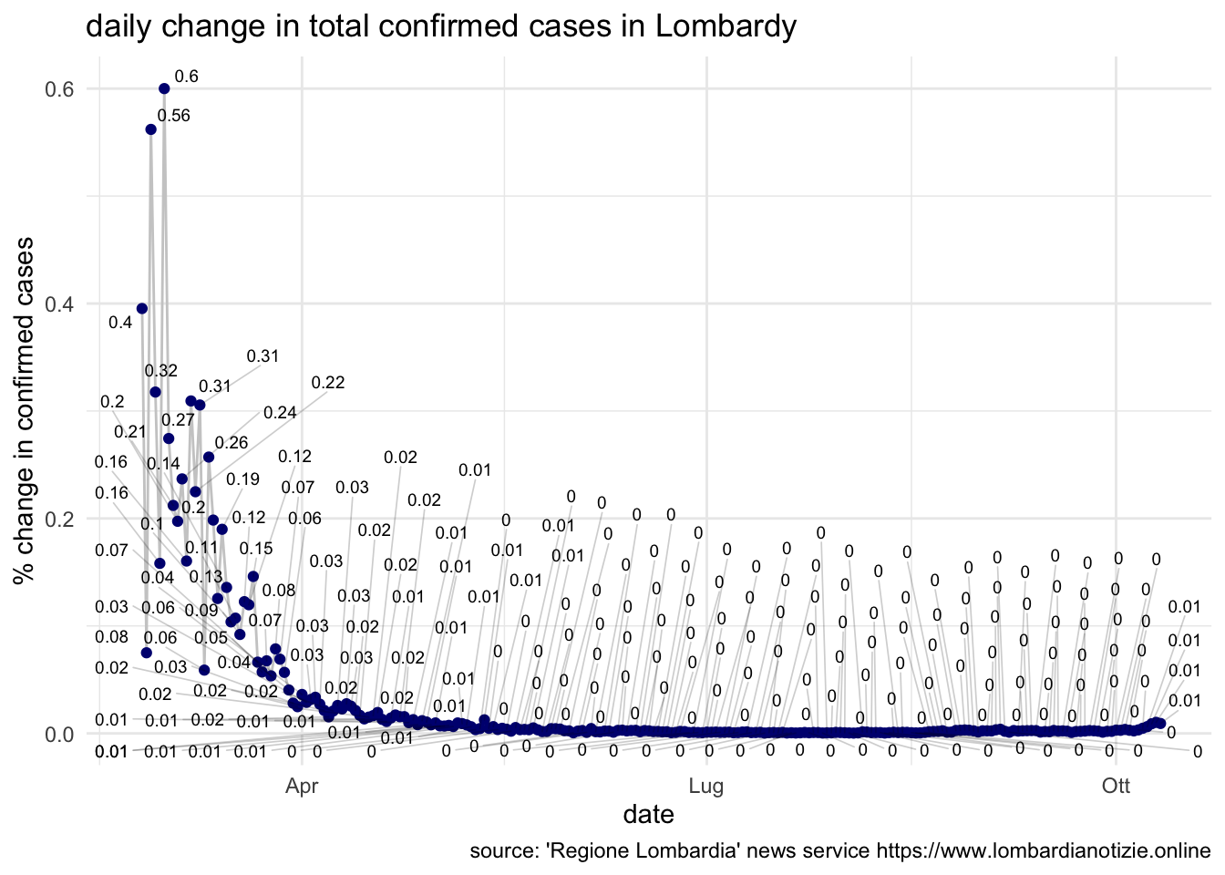
daily change in confirmed cases in Lombardy
As you probably already know the most serious coronavirus outbreak started directly in Lombardy, where I currently live and I am writing from. I am therefore taking separared note of number related this region. You can find them on the Google Sheet and the daily change plotted below:
comparison between Lombardy and Hubei province
Since Lombardy is the first place where coronavirus really appeared in Italy, and it currently is the region where the main outbreak is observed, I thought it would have been interesting to compare the shape of the cumulated number of confirmed cases measured in Lombardy with the same number measured in Hubei from the beginning of the outbreak.
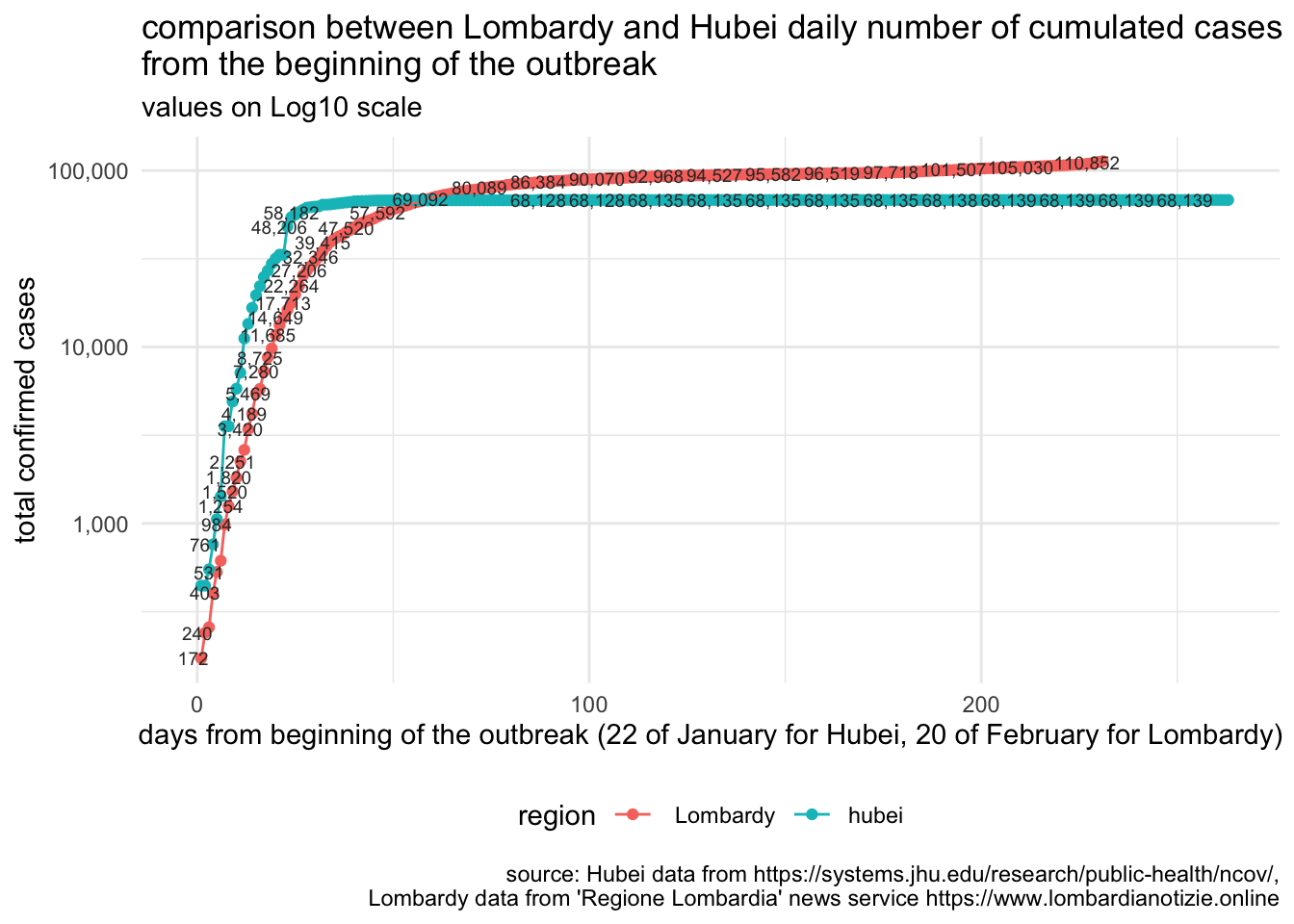
Unfortunately, Lombardy pattern looks quite different from day 5 on, with a steeper increase compared to the chinese one. This is also the reason that guided the adoption from the Italian Government of a nearly complete lock-down of the Country.
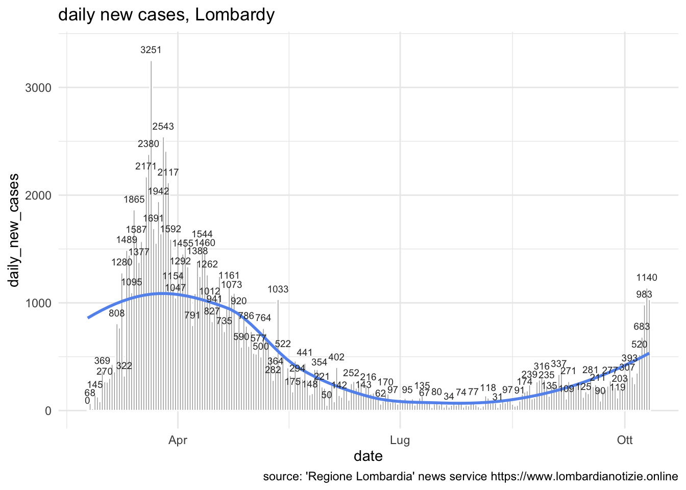
daily new cases
As done for Italy as a whole, let’s monitor the number of daily new cases for Lombardy as well:
ICU numbers
italy_icu %>%
  ggplot(aes(x = date,y = daily_new_ICU, label = daily_new_ICU))+
geom_bar(stat= 'identity', colour = "white", fill = "gray60")+
      geom_text(colour = "gray20", size = 2.5, nudge_y =5, check_overlap = TRUE)+
  theme_minimal()+
  theme(legend.position = "bottom")+
  labs(title= "daily new ICU, Italy",
          x = "date",caption = "source: Protezione Civile")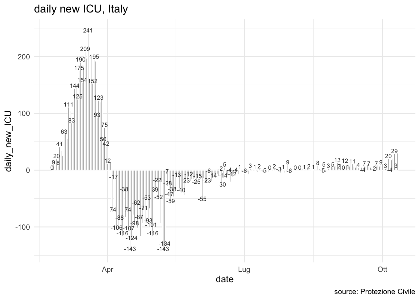
This is the number of total ICU
italy_icu %>%
  ggplot(aes(x = date,y = ICU, label = ICU))+
geom_bar(stat= 'identity', colour = "white", fill = "gray60")+
      geom_text(colour = "gray20", size = 2.5, nudge_y =5, check_overlap = TRUE)+
  theme_minimal()+
  theme(legend.position = "bottom")+
  labs(title= "Total number of ICU, Italy",
          x = "date",caption = "source: Protezione Civile")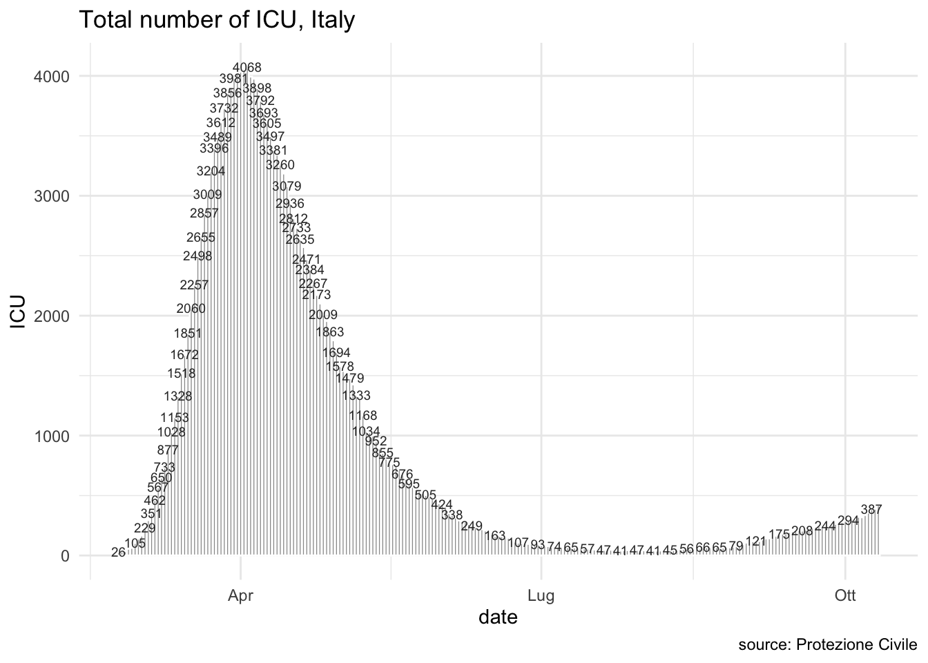
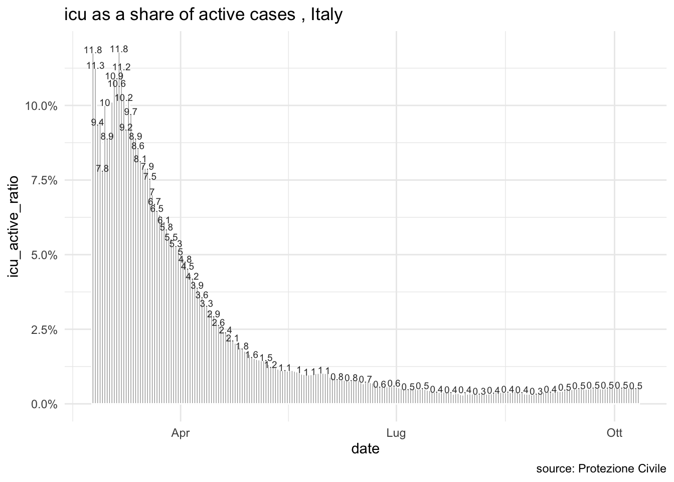
Let’s try one more analysis, computing the number of total ICU as a ratio of total active cases.
italy_icu %>%
  ggplot(aes(x = date,y = icu_active_ratio, label = round(icu_active_ratio,3)*100))+
geom_bar(stat= 'identity', colour = "white", fill = "gray60")+
      geom_text(colour = "gray20", size = 2.5, nudge_y =0.001, check_overlap = TRUE)+
  theme_minimal()+
  theme(legend.position = "bottom")+
  labs(title= "icu as a share of active cases , Italy",
          x = "date",caption = "source: Protezione Civile")+
  scale_y_continuous(labels = scales::percent)